> For the complete documentation index, see [llms.txt](https://docs.heeler.com/mrecEO40m5D6bt7Pq5pE/llms.txt). Markdown versions of documentation pages are available by appending `.md` to page URLs; this page is available as [Markdown](https://docs.heeler.com/mrecEO40m5D6bt7Pq5pE/operate/dashboards/weekly-and-monthly-overviews.md).

# Weekly and Monthly Overviews

The two trend dashboards — a rolling four-week operating view for weekly reviews, and a selectable 6-, 12-, or 24-month long-range view for business and board reporting.

Priorities and Coverage tell you about *right now*. The two **Overview** dashboards tell you about *direction* — whether the program is pulling ahead of incoming risk or falling behind. They share the same shape (intake, fixes, SLO performance, prevention) at two different zoom levels:

* **Weekly Overview** — a rolling four-week operating view for weekly security reviews and team reporting.
* **Monthly Overview** — a long-range view over a selectable 6-, 12-, or 24-month window, for monthly business reviews, board reporting, and program planning.

Both respect the [global filters](/mrecEO40m5D6bt7Pq5pE/operate/dashboards/filtering-and-exports.md#the-global-filter-bar), so either can be scoped to a team, tier, or application for a targeted readout.

{% hint style="info" %}
**For:** Weekly security reviews and team reporting (Weekly), and monthly business and board reviews (Monthly). The trends only accumulate once the [operating loop is connected](/mrecEO40m5D6bt7Pq5pE/get-started.md) — code, cloud, and runtime.
{% endhint %}

## Weekly Overview

**Dashboards → Weekly Overview.** The question this answers: *how did we do this week, and are we keeping pace?*

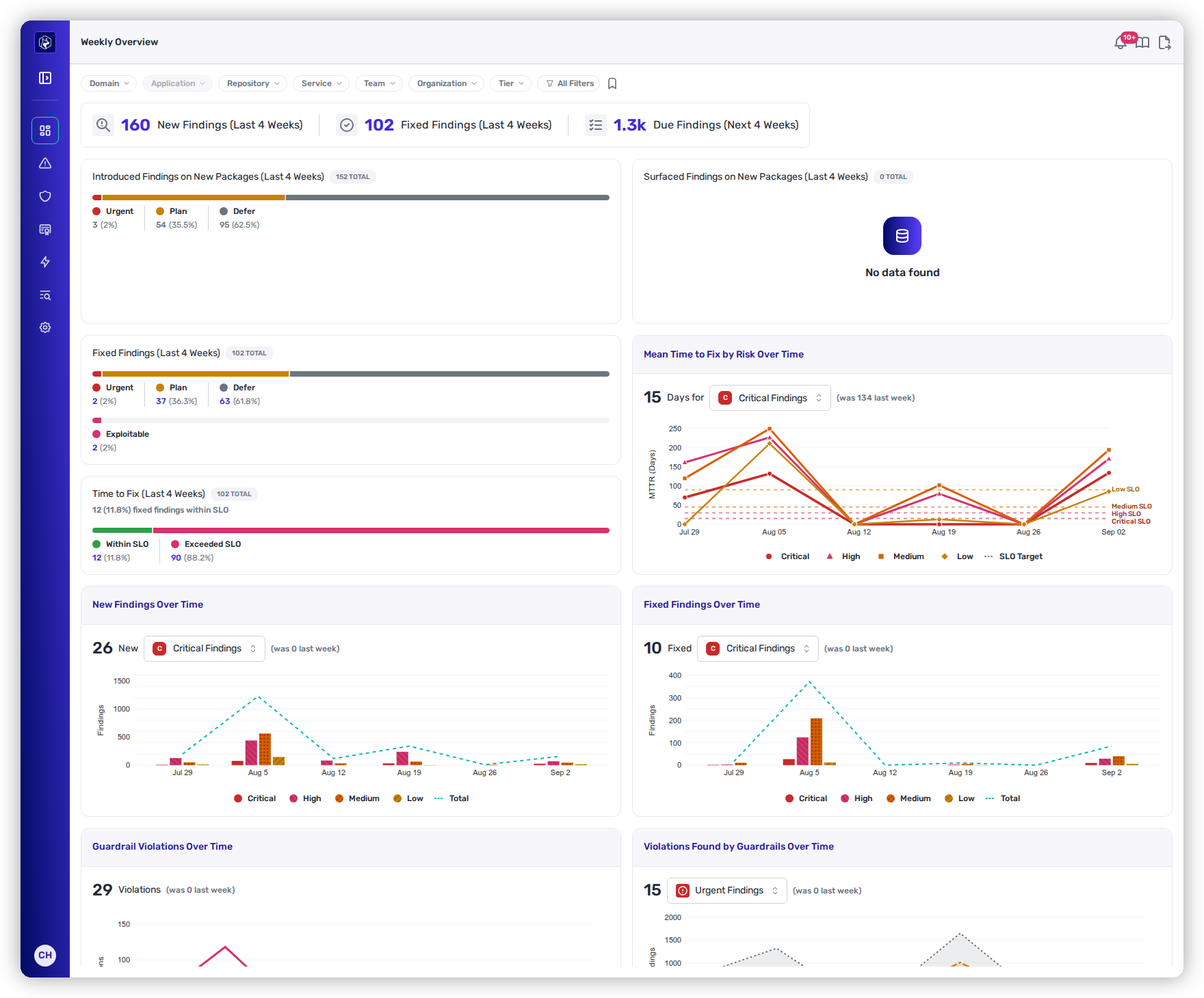
<figure><img src="https://414480750-files.gitbook.io/~/files/v0/b/gitbook-x-prod.appspot.com/o/spaces%2FXP3dp2kecwKA2KvYkntz%2Fuploads%2Fgit-blob-24225ed8c3e47a3159c1daffe6e18157272d58b3%2Fcc-vis-weekly.png?alt=media" alt="The Weekly Overview: summary cards, finding-activity panels, SLO performance, and trend charts."><figcaption><p>Weekly Overview — summary cards up top, then where new findings come from, what got fixed, and how SLO performance is trending.</p></figcaption></figure>

### Summary cards

Three headline numbers frame the week's workload:

| Card                              | What it shows                                                                            |
| --------------------------------- | ---------------------------------------------------------------------------------------- |
| **New Findings (Last 4 Weeks)**   | Total new findings introduced across the last four weeks.                                |
| **Fixed Findings (Last 4 Weeks)** | Total findings remediated across the last four weeks.                                    |
| **Due Findings (Next 4 Weeks)**   | Findings whose SLO deadline falls in the next four weeks — the forward-looking workload. |

### Where findings are coming from — and what's getting fixed

Three activity panels break intake and remediation down by **Heeler Risk** band (Urgent / Plan / Defer), each with the share that's **auto-fixable**:

* **Introduced Findings on New Packages** — risk added by *code changes*: new dependencies brought in by developers or agents.
* **Surfaced Findings on Existing Packages** — risk that appeared *without any code change*: a package already in your codebase became known-vulnerable when new CVE research was published.
* **Fixed Findings** — what was remediated in the period, by risk band, with the share of fixes that addressed **exploitable** findings — confirmation that effort is landing on the right things.

### SLO performance

**Time to Fix (Last 4 Weeks)** shows the period's total fixes split between those resolved **within SLO** and those that **exceeded** the deadline. This is the primary weekly compliance metric — the goal is to keep the within-SLO share climbing.

### Trend charts

| Chart                                  | Use it to spot                                                                                                                                                    |
| -------------------------------------- | ----------------------------------------------------------------------------------------------------------------------------------------------------------------- |
| **Mean Time to Fix by Risk Over Time** | Whether remediation speed is improving week over week, and whether any severity tier is chronically missing SLO (the SLO threshold is drawn as a reference line). |
| **New Findings Over Time**             | Weeks with unusual spikes in new risk — e.g., a large dependency update that introduced many findings at once.                                                    |
| **Fixed Findings Over Time**           | Whether you're keeping pace with intake — compare this directly against New Findings.                                                                             |
| **Guardrail Violations Over Time**     | Whether risky dependencies are being introduced more often, or guardrail coverage has expanded to catch more.                                                     |

Above the Mean Time to Fix chart, a headline figure gives the measured mean for one band across the four weeks shown. Choose the band from the select beside it. A week in which nothing in that band was fixed is skipped rather than counted as zero.

The dashed lines on the chart are the SLO targets, one per band. They are the targets you set, not part of the measured mean.

## Monthly Overview

**Dashboards → Monthly Overview.** The question this answers: *is the program getting healthier over the long run, and can I show it?*

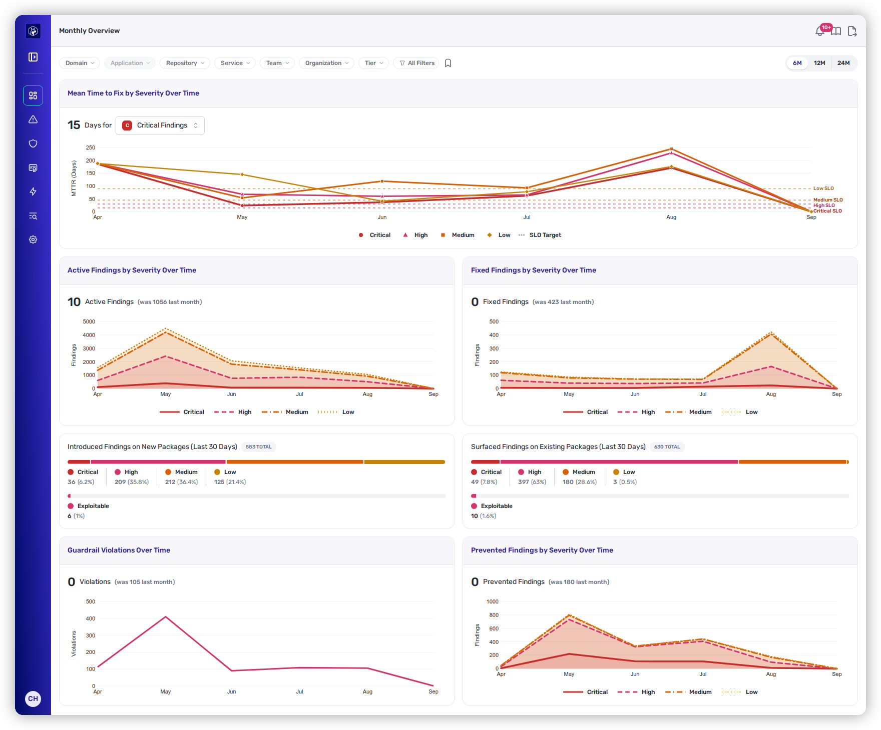
<figure><img src="https://414480750-files.gitbook.io/~/files/v0/b/gitbook-x-prod.appspot.com/o/spaces%2FXP3dp2kecwKA2KvYkntz%2Fuploads%2Fgit-blob-8266c906ddde27240dfcfb22c781c9f13506534a%2Fcc-vis-monthly.png?alt=media" alt="The Monthly Overview: long-range MTTF, active-inventory, and fixed-volume charts."><figcaption><p>Monthly Overview — remediation speed, backlog size, and fix volume over the selected window, for business and board reporting.</p></figcaption></figure>

A range control sets the window to **6**, **12**, or **24 months**, and every chart on the page follows it. The current month is included as a partial bucket, so the most recent point is month-to-date rather than the last complete month.

### Remediation performance

Three charts track speed and backlog across the selected window:

| Chart                                      | What it tells you                                                                                                      |
| ------------------------------------------ | ---------------------------------------------------------------------------------------------------------------------- |
| **Mean Time to Fix by Severity Over Time** | The headline "are we closing findings faster?" trend, with the SLO threshold as a reference line.                      |
| **Active Findings by Severity Over Time**  | The size of the open backlog at each month's end — rising means intake is outpacing fixes; falling means net progress. |
| **Fixed Findings by Severity Over Time**   | Monthly remediation volume — read alongside Active Findings to see whether fixes keep pace with new risk.              |

Above the Mean Time to Fix chart, a headline figure gives the measured mean for one band across the window. Choose the band from the select beside it.

The figure covers the complete months only. The month in progress is plotted on the chart and left out of the figure, so a slow start to the current month does not move it. A month in which nothing in that band was fixed is skipped rather than counted as zero.

The dashed lines on the chart are the SLO targets, one per band. They are the targets you set, not part of the measured mean.

### Where findings came from

Two panels split the month's intake by severity, each with the share that's **exploitable**:

* **Introduced Findings on New Packages (Last 30 Days)** — the risk footprint added by code changes.
* **Surfaced Findings on Existing Packages (Last 30 Days)** — risk that appeared because new research was published against packages you already had.

### Prevention

Two charts quantify what the [prevention layer](/mrecEO40m5D6bt7Pq5pE/prevent/pr-guardrails.md) is buying you:

* **Guardrail Violations Over Time** — violations detected in pull requests each month.
* **Prevented Findings by Severity Over Time** — findings blocked from ever entering the codebase, by severity. This is the "risk we never had to remediate" number.

### Package intelligence

Two tables at the bottom turn a year of history into targets for a remediation campaign:

**Most Vulnerable Packages (Last 12 Months)**

| Column           | Description                              |
| ---------------- | ---------------------------------------- |
| **Package**      | The package name and ecosystem.          |
| **Modules**      | Manifest files referencing this package. |
| **Services**     | Services using it.                       |
| **Findings**     | Total findings associated with it.       |
| **Remediations** | Distinct remediations available.         |

A single upgrade to a widely used package here can clear hundreds of findings across many services — this table finds those high-leverage targets.

**Packages Updated Most Frequently (Last 12 Months)** ranks packages by update count, alongside modules affected and open findings. A high-churn package that's updated constantly but *still* carries open findings is a signal to revisit its upgrade strategy or pinning approach.

{% hint style="success" %}
Read the two overviews as a pair: the **Weekly** view is where a team catches a bad week early; the **Monthly** view is where leadership sees whether the last quarter of effort actually moved the backlog and how much risk prevention kept out entirely.
{% endhint %}

## Related

* [Priorities](/mrecEO40m5D6bt7Pq5pE/operate/dashboards/priorities.md) — the right-now view that these trends contextualize.
* [Remediation Workbench](/mrecEO40m5D6bt7Pq5pE/operate/dashboards/remediation-workbench.md) — turn a worsening trend into a burn-down plan.
* [PR Guardrails](/mrecEO40m5D6bt7Pq5pE/prevent/pr-guardrails.md) — the prevention layer behind the guardrail and prevented-findings charts.


---

# Agent Instructions
This documentation is published with GitBook. GitBook is the documentation platform designed so that both humans and AI agents can read, navigate, and reason over technical content effectively. Learn more at gitbook.com.

## Querying This Documentation
If you need additional information that is not directly available in this page, you can query the documentation dynamically by asking a question.

Perform an HTTP GET request on the current page URL with the `ask` query parameter, and the optional `goal` query parameter:

```
GET https://docs.heeler.com/mrecEO40m5D6bt7Pq5pE/operate/dashboards/weekly-and-monthly-overviews.md?ask=<question>&goal=<endgoal>
```

`ask` is the immediate question: it should be specific, self-contained, and written in natural language.
`goal` is optional and describes the broader end goal you are ultimately trying to accomplish on behalf of the user. GitBook uses it to tailor the answer towards what is most useful for that goal.

The response will contain a direct answer to the question and relevant excerpts and sources from the documentation.

Use this mechanism when the answer is not explicitly present in the current page, you need clarification or additional context, or you want to retrieve related documentation sections.